
Screenshot from my Watch of me using Watch to take picture from iPhone. Whoa. Meta.
Buying the Apple Watch on day one for me was the precise opposite of buying an iPad – I had absolutely no idea why I was buying it, but figured I’d either like/love it, or return/eBay it – in other words, no downside. One week into using it, and I’m well into Like, but not yet at Love. I’d hold the core Watch functionality at 50% accountable for the Like, 30% for Apple apps, and 20% for third-party apps. Or, as I see it, as long as better apps come along, which is inevitable, I may soon Love the Watch. And astute readers know that I must end this post with “only time will tell” – apologies.
If you want to learn more about the Watch, or read countless “must-get” App lists, I’m sure you can figure that out. I’m focusing specifically on my personal impressions and experiences. Here they are, in no particular order.
1. Having the Watch is relaxing.
I put this first, as it’s the most important thing about the Watch. My iPhone now spends about 90% more time in my pocket, I don’t leave it out on tables or my desk, it’s just away. I can deal with at least 2/3 of my notifications through my Watch, and they go away. Further, I feel less urges to glance at my phone – ever. Considering how much I find notifications distracting and frustrating, yet utterly necessary in modern life, the Watch is a clear win on the claim of helping you deal with the basics of modern interruptions.
2. There are some useless apps:
For non-Apple Watch owners, know this: 100% of your regular Notifications will appear on the Watch. So much like how annoying apps that just show you the content of a blog can be, Watch apps that just show you something you’d get via Notifications are pretty silly at this point. Perhaps my feelings on this will change with more than a week’s exposure, but I’m seeing a lot of things I don’t need to see.

3. There is a lot more iPhone co-dependency than I thought/expected
The Watch doesn’t talk to any other of my Apple products – so notifications from iPad/Macbook don’t hit my wrist. It’s specifically an extension of the iPhone. Further, there are many Watch apps, including those from Apple, which require significant phone-based interactions to work. This isn’t a good/bad thing, but it’s an important mindset.
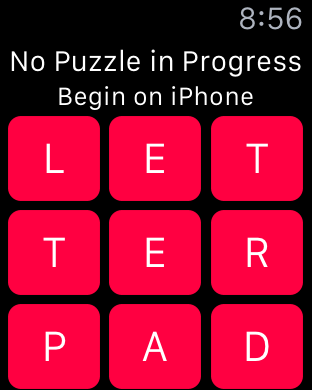
Letterpad game

Post-Shazaming a song
4. Prediction: App Management is going to become a problem
Installing Apps happens via your iPhone, where you manually, on an app-by-app basis, “install” them to your Watch. It’s seamless and elegant. Or it is as long as I still have less than 50 apps with Watch functionality. When this hits 100+ apps, it’s going to be a nuisance. Ditto for “navigating” apps on the Watch.
Installing an app on the Watch
5. The Digital Crown is awesome, intuitive, and I love using it. And I forget about it a lot.
It’s smooth and elegant, and whenever I remember to use it, it works exactly as I’d hope/expect it to. But most of the time I forget it’s there, as I’m soooo used to everything being touch-based. Not that it should work different on the Watch, but it’s a “Getting Used to it” curve.
6. Some very clever app examples.
There really aren’t a ton at this stage, but the “promise of what’s to come” is already clearly in the air. Here are my standouts:
a) Uber
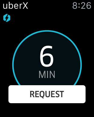
Perfect use of Watch. Either Summon your Uber, or see Current Status of Uber. A+ implementation.
b) Apple Maps

Browsing, Searching, Contacts’ addresses, and everything you might want. Well done.
c) Apple Maps Navigation mode
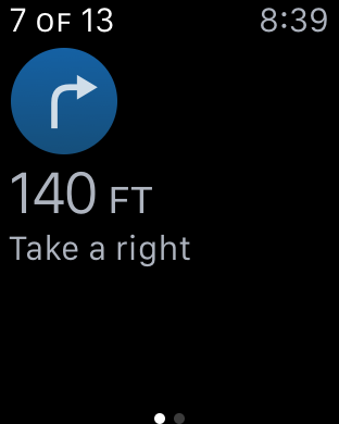
Having the Watch vibrate right when I need to turn is amazingly helpful. Possibly the most useful specific feature on the Watch overall.
d) Charles Schwab
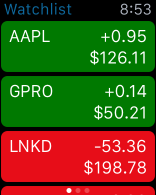
Pulls in my portfolio with quick at-a-glance info. Not particularly better than Apple’s own Stocks, but it’s my personal/actual portfolio, so no manual changes necessary.
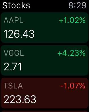
This is Apple Stocks – also nicely done, just showing for comparison.
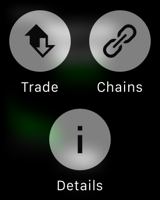
“Force Push” in Schwab app enables a 1-click to start a trade, which you complete on the Phone. Perfect use of “get a notification, trigger an action.”
e) Transit
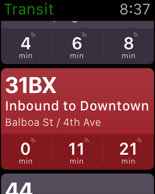
Real-time, geo-located public transportation. So much better than pulling out the iPhone for same info.
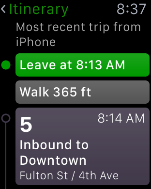
Also able to pull up most recently booked trip on your iPhone
One caveat re Transit – I think it’s just a bug, but I’ve found it just doesn’t always update properly, and sometimes I’m at the office and it still thinks I’m at home.
f) SPG
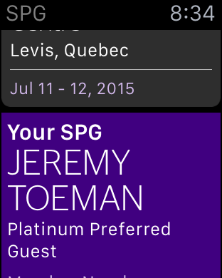
Upcoming Reservations, Points/Status, and keyless entry!
g) Yelp

Find restaurants near you in seconds. And it works. And they keep it simple.
h) Circa
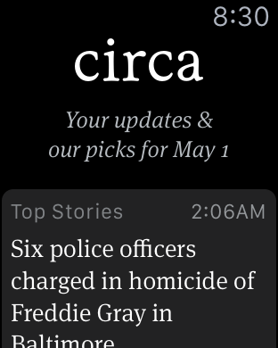
Candidly I don’t use Circa as much as Zite for my news reader, but their integration of recent headlines is perfectly done. Haven’t tried Flipboard yet.
i) Mailchimp
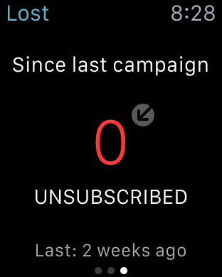
I really like the at-a-glance look at email campaign statuses. Another example of a non-ambitious, useful little app. That said, I doubt I’ll actually use it much, as I rarely just want to look at campaigns from such a high-level.
j) Wunderlist
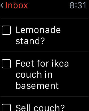
If you are already a Wunderlist user, their Watch extension works exactly right. Quick glances, ability to mark things done, etc.
7. There’s also a lot of “still waiting for the a-ha moment” apps.
I have to imagine as an app developer with no prior history of the Watch that it’s a very difficult thing to have projected the how of people using it. So I think there’s a lot of “1.0 efforts” that will get better over time, but for now leave me a little “huh?”
Also, I think there’s a lot of apps that just didn’t need full extensions to the Watch, where a basic Push Notification does the job. Some examples:
a) Calm

So it’s like the built-in timer, but with nicer background? Am I supposed to stare at this? Because if so, I’m not feeling Calmer…
b) Mint
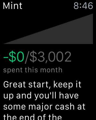
Granted I haven’t seen any real improvements to Mint since their acquisition, but this is a real throwaway. Poorly implemented, confusing to set up, and questionable value proposition. Would be better as simple push notifications.
c) Apple Store
Haven’t yet figured out why I need this app. Maybe I just don’t buy enough products?
d) Starbucks

Maybe when any Starbucks actually put Apple Pay terminals in place I’ll love this, but until then, it’s pretty useless.
e) Twitter

Twitter seems to make a lot of people’s “top Apps for Watch” list. For me it’s a pretty mediocre experience, with hard-to-read individual Tweets (often cut off before 140 characters), impossible to Tweet usefully (no links, hashtags, @replies, etc). Twitter on Watch seems like just a bridge too far for an already difficult-to-use Twitter experience.
f) Skype
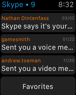
I honestly don’t know what I was/should’ve been expecting here, but Skype on your Watch without even support for audio-only calls is pretty weak.
There’s oodles more, including some native apps, that could do a lot better, but again, 1.0.
8. Siri is making a lot more sense, and it’s working really well.
I’ve always enjoyed Siri, even as a fairly infrequent user, I thought it was a great foray into trying to make computing more invisible. On the Watch, though, I use it a lot, and find it works better than I expect – particularly for texting folks.
9. Evernote and Uber are the kind of apps that will lead to Love
Evernote on my wrist is nice for quickly searching for important info. But it’s much much cooler as a record a memo feature. My only wish would be recording audio memos – something I’m shocked isn’t default functionality between the Watch and iPhone.
Uber, however, may be the most perfectly designed Watch app out there. Launch the app, and within a few seconds the familiar “get an Uber” button appears. Perfect, as I don’t care about my Profile or Invite a Friend or the few other things Uber can do in the iPhone app. Then, with an Uber en route, I get the visible countdown and map/status until the driver’s arrived. Them, while driving, I see the map of where we’re going. It’s just perfectly done.
 10. Photos is far more compelling than I’d have projected
I was pretty skeptical of any use of Photos on the Watch – considering how small they are. But I really enjoy having my Favorites album synched – it’s visually very attractive, a great reminder of using the Digital Crown, and a nice/comfortable feeling.
11. Force Touch is a great experience concept.
Your fingers have a tremendous amount of nerve endings and are incredibly sensitive “devices”. So having the “push a little harder to cause an action” is welcome, easy, and intuitive, and I’d hope to see it come to other touch-input products in the near-term.
12. I’m more impressed with battery life than I was expecting
I find I only need to charge it every other night – which, as a non-Watch-owning friend pointed out to me is quite frequent from a watch perspective. But considering the expectations were set around charging it nightly, I’m pretty happy so far.
13. The Remote and Navigation are the best apps from Apple
Beyond basic notifications, the apps I use the most proactively are Remote and Nav. For Remote, it just works really well, and I frequently misplace my Apple TV remote as it is. For Nav, the physical reinforcement of “turn soon” works great in areas where you really need your GPS – especially those “do I turn here or the next block???” moments.
14. I haven’t gotten my head around Activity yet
I like getting told to stand up once an hour – and generally I’m doing whatever it tells me to. And I like seeing the steps, and calorie count, etc. I don’t know if it does (or doesn’t) motivate me, and I don’t trust the accuracy (not that I distrust the effort/intent, just that I doubt all fitness tracking at present). Maybe I just don’t care much about quantified self – I feel pretty good with unquantified me.
15. I want more extension-of-my-iPhone functionality
My Watch should tell me when my iPhone is low on power or fully charged, and should give me the option to show iPhone battery life in the Watch Face. Ditto for cell signal/wifi connection. In both cases (power/network), these are essential pieces of information for actually using my Watch, and should be available at a glance.
16. Want. More. Faces.
17. The Watch could be a bit smarter.
It’s super-easy to add Timer or Stopwatch to the Faces. But if I don’t have it on, and I do have a timer going, shouldn’t this be a “trumping” level of visibility? I really like using timers in general (17 minutes of intermission between periods), but feel this should be perennially visible when active.
18. The Watch-to-Watch functionality is cool, but too hard to get using.
There’s literally no way for me to determine which of my contacts has a Watch, which really tears apart the concept of how cool the “send a gesture/tap” to a friend features are (and they are cool). Shouldn’t something in my iCloud ecosystem help me figure out who these potentially wonderful people are, and even where?
19. No more Phantom Ringing Upper Thigh
I’ve stated several times how calming the Watch is – but one especially pleasant side effect is I never “wonder” if I got a notification anymore. Phantom Wrist doesn’t appear to be a thing, and I already have stopped expecting it elsewhere.
20. Phone calls sound surprisingly good
Not sure where the mic is on it (and frankly, I don’t care), but I’ve had a few calls on it without the other party even thinking they were on speakerphone, let along Dick Tracy style. I’ve also noticed that if I take calls on it in windy environments, it actually outperforms the iPhone for avoiding wind tunnel conversation effect.
21. It’s not 100% calibrated
I definitely find times when I “pull up” the Watch, only to see a blank screen. And even a shake or two might still leave it blank. Further, sometimes I just have my arm at an angle and the Watch seems to think I’ve “noticed” a notification. I assume this will improve over time.
22. I don’t feel as lame as I’d think using the Watch
Whether it’s taking a call, replying to a quick text, or looking at a notification, it feels much more natural than I’d expect. That said, I’ve caught myself several times in the “I should really just pull out my iPhone” phase of things. Curious to see how this calibrates over time for me personally.
23. Others get very excited to see it.
Was at my bank a few days back, I think I sold 3-4 of them in the span of 2 minutes just by answering a text. There’s something that’s gotten people really excited here. Again, not sure how this plays out in the long term.
24. I want more in-iOs integration
On my iPhone, a calendar location is instantly linked to launching Maps. Not true on Watch – but I don’t see why not. When I scan an email on my Watch, all links have been stripped. Why not just give me the chance to pull it up in Safari on my iPhone, I can look at it later. It could even go into Reading List automatically. There’s a lot of these little “in between” moments that I think could be improved over time.
25. It’s still a keeper
I can’t project 3 months out, once the fascination has worn off. But as of now, I have no desire to return it, I enjoy wearing it from morning til night (I don’t bring any “connected” products into my bedroom/sleepytime places), and I feel it’s a general improvement to digital living. Or is that living digitally?
Will I say the same in a year? Well, as forewarned many words ago – only time will tell.


 The second week of use was my true “now how do I feel” week with the iPad. Was it actually better/easier/more convenient than my MacBook? Did I really want to carry this on the bus or other places? Would a murse fit into my lifestyle okay (separate post of iPad cases & sleeves coming)?
 I’ve spent a few
 eStarling

 I recently had the opportunity to check out
